Yallo Sales Portal
The tool behind every sale
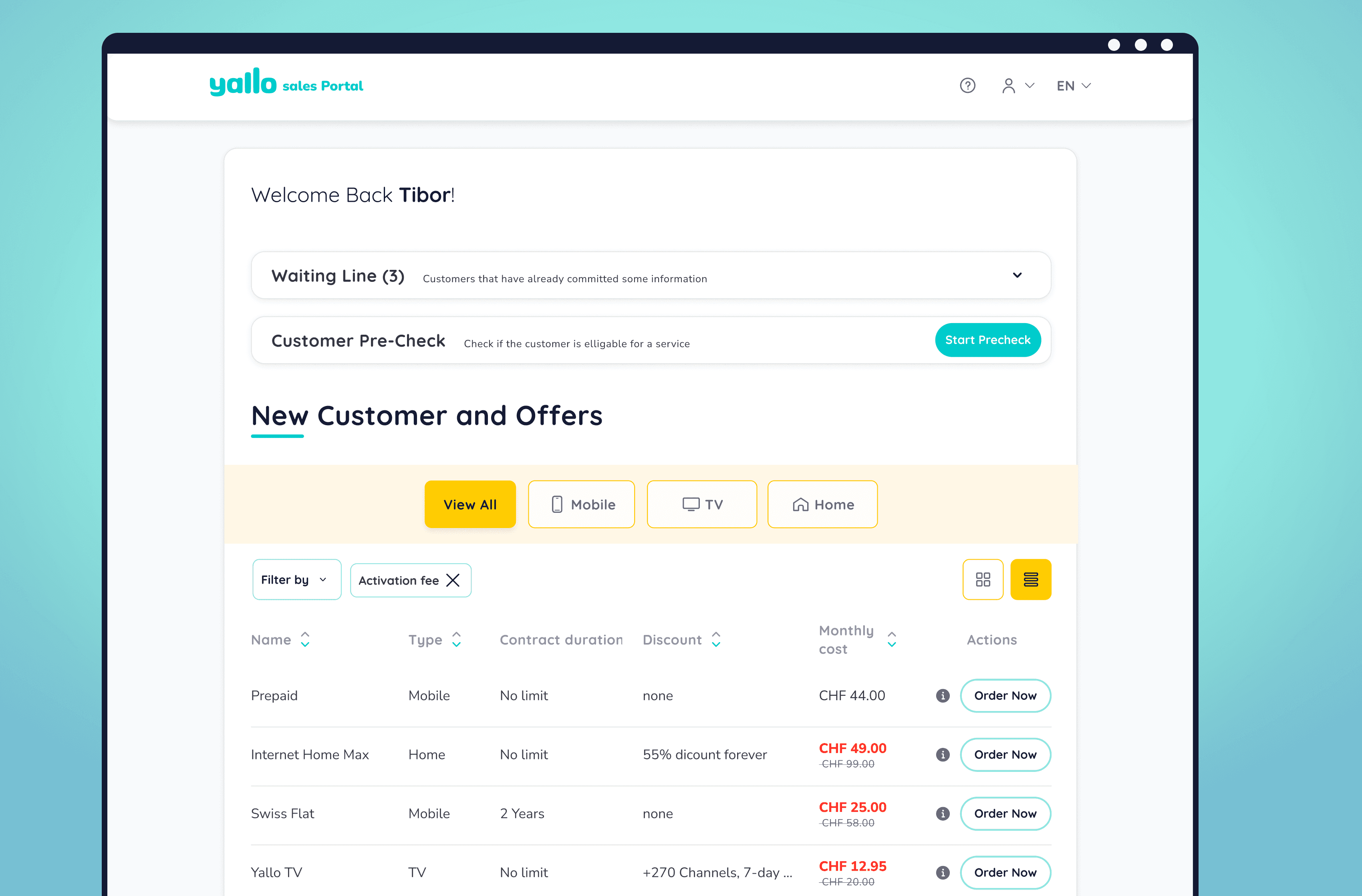
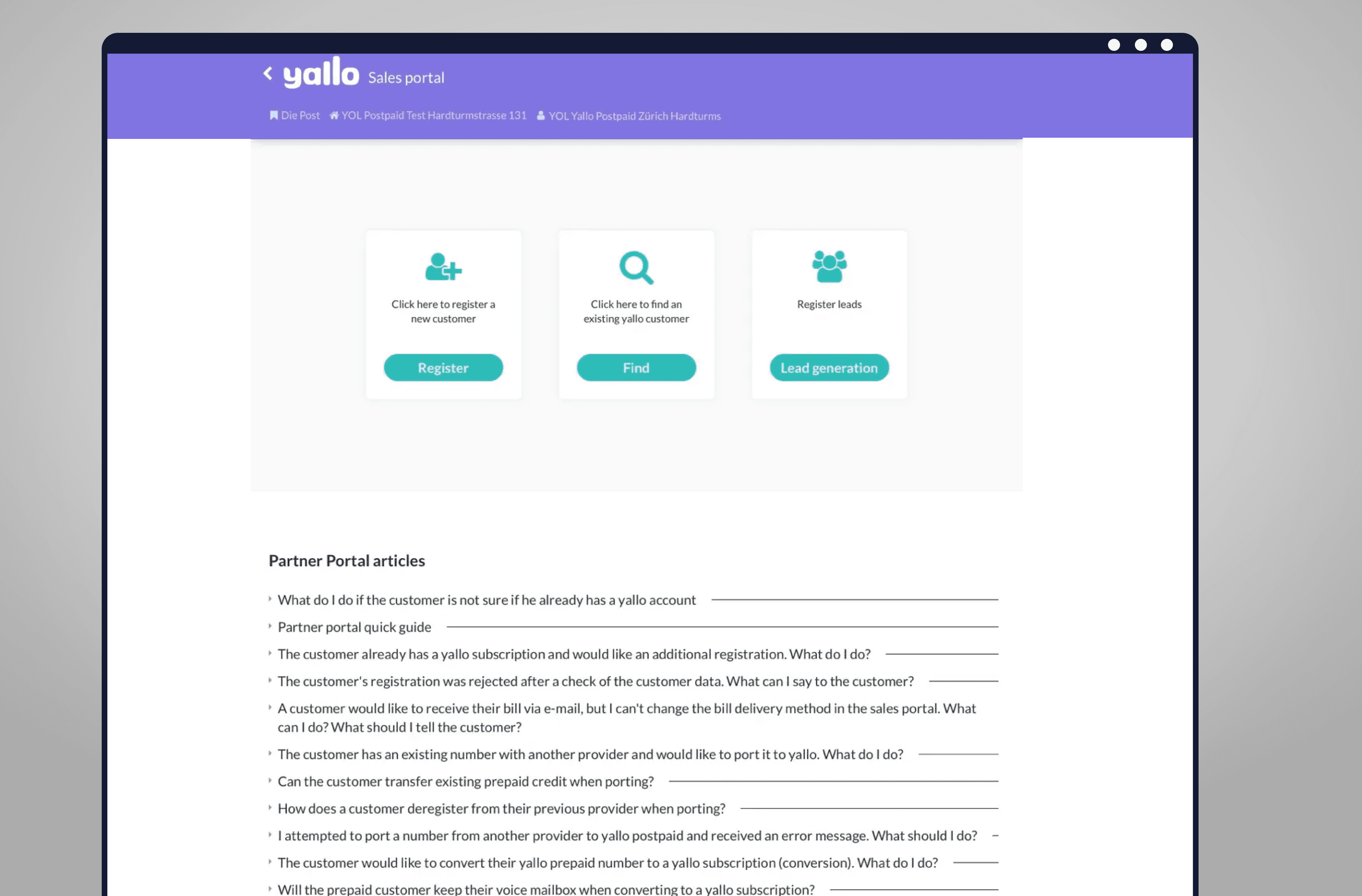
SLIDER: Click / Tap & slide the arrow in the middle to Compare Old POS Homepage / New POS homepage
Problem. yallo is one of Switzerland's largest telecom brands. Every sale runs through one internal tool, and it was slow, dated, and built years earlier around a manual process. Everyone knew it needed work. No one agreed on what that meant.
What I did. I learned the tool by using it, turned earlier research into a direction the stakeholders could align on, and redesigned the core flows.
Outcome. Delivered production-ready and validated with real agents, who asked when they could start using it.
Challenges
A domain I'd never worked in. Telecom sales, checkouts, credit checks, SIM activation. I had to understand it well enough to ask the right questions.
Research without a direction. Interviews existed from an earlier phase. Turning them into decisions was the open part.
No shared goal. Sales, marketing, product, tech, resellers. Every group had a different idea of what the redesign was for.
No design foundation. No files, no components, no system. Only a marketing brand to build from.
01 —
LEARNING THE SYSTEM
Hired to redesign a tool no one could explain.
I was brought in to redesign the tool, but no one around me could explain how it worked or what a redesign should actually solve. There was no brief, no design files, and the earlier research was run by someone who had already left
Mapping the system
I traced every flow, documented the questions and gaps I found, mapped the stakeholders, and reorganised the earlier research into something I could actually work with.
The audit, findings, and stakeholder map I built to understand the tool before the first client meeting.
02 —
AGREEING ON THE GOAL
Everyone meant something different.
For some, "redesign" was new visuals. For others, new features, or replacing the tool entirely. Nothing could move until the goal, and whose priorities it served, was shared.
A prototype to react to
I led the kickoff with a rough, low-fidelity prototype, the first time the client saw their own tool reorganised. It gave everyone something concrete to argue with, and the conversation moved from defining a word to making decisions.
Low fidelity on purpose. It was there to start the conversation.
03 —
DESIGNING IT
Building the redesign, one flow at a time.
With a shared direction, I designed the core flows: home, checkout, and customer profile. There were more ideas than the project needed, so the work became deciding what to add, what to improve, and what to leave alone.
Before
The old home: a few cards, then a marketing-style page of offer boxes. More pitch than tool.
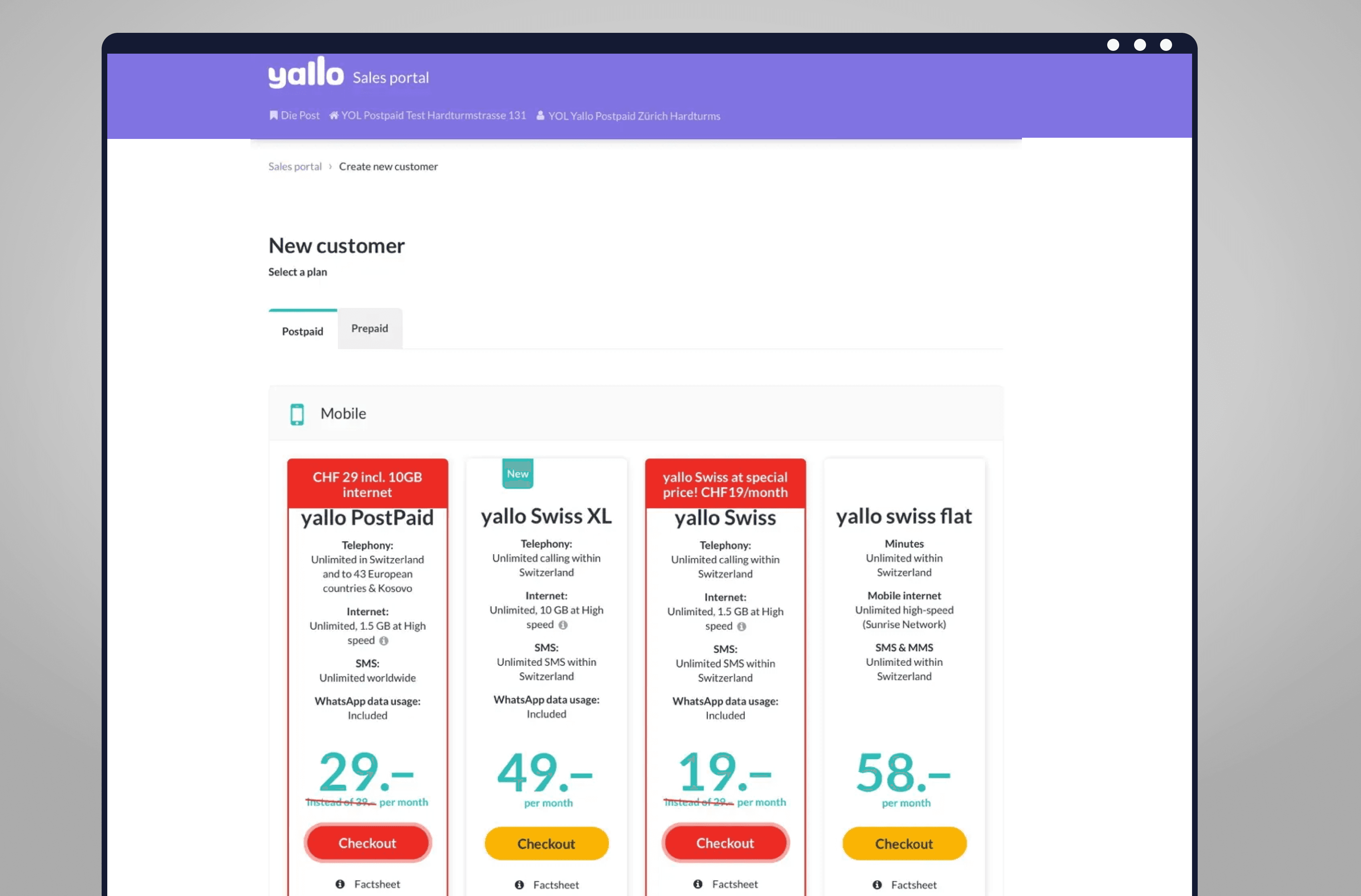
The old home, before the redesign.
After
I replaced it with a scannable table, so an agent could read every product and offer at a glance.
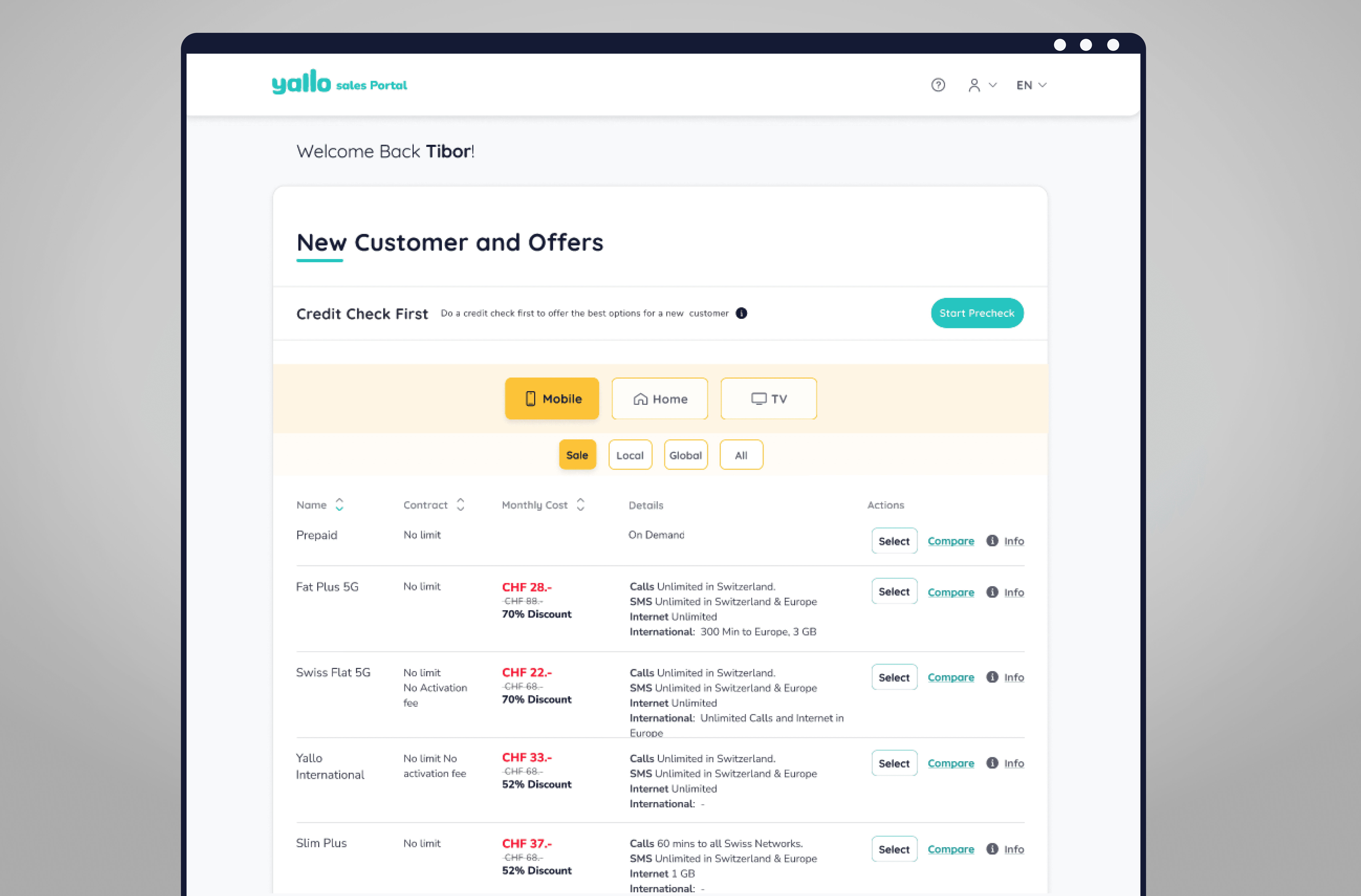
The new home: every offer, scannable at a glance.
Reworking the checkout
The checkout had several known problems, but one kept coming up: agents could build an entire offer before finding out the customer couldn't get it. I redesigned the flow and made that check accessible throughout the sale.
The redesigned checkout, with the critical check available throughout the flow.
From customer data to a working dashboard
Before, opening a customer led straight to their plan. The information behind it existed, but there was no useful overview. I brought the relevant data, consumption, contracts and opportunities together into one dashboard.
One place to understand the customer and what they already have.
04 —
TESTING WITH THE AGENTS
Two groups, two questions.
I tested with the managers who would approve it and the agents who would work in it daily. One judged the fit for the business, the other the speed against what they had. The feedback shaped the final version, which I delivered complete with the design system at the last meeting.
Testing in the field
With the people who'd actually use it, in stores and remote.
Testing the redesigned flows with sales agents.
SLIDER: Click / Tap & slide the arrow in the middle to Compare Old POS Homepage / New POS homepage
From feedback to final
Testing confirmed that the credit check needed even more prominence. I brought it into the header and made it harder to miss throughout the checkout.

Right ( updated) vs Left (Pre-Test). One of six improvements made after testing, shown here in the final checkout.
Ready to hand over
I delivered the final flows and design system ready for yallo's development team to take forward.
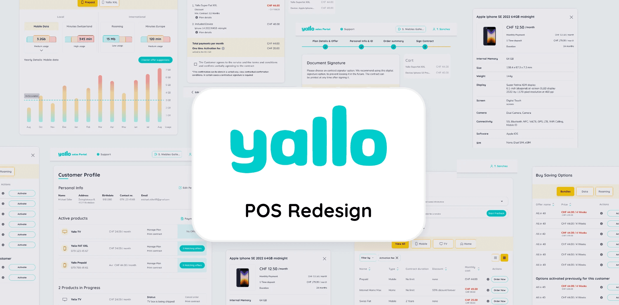
The final POS Tool design system and handover.
Credits & Technical Scope
Client
yallo (Sunrise Group)
UX Architect
Sebastián Gallego Niebles
Business Leads
Philipp Lehmann, Daniel Yarsan, Mathieu Varnet
CTO
Client Leads
Design Support
Nataschja van Zanten
Platform
Native Desktop Application
Tools & Methods
UX Audit, Research Synthesis, Stakeholder Mapping, User Flows, Wireframing, Prototyping, Usability Testing
Softwares
Figma, Figjam, Google Analitics, Miro