EPOCH
From concept to investor-ready product

Problem. EPOCH had an investment concept, an initial identity and a detailed feature brief. The founders needed to turn it into something tangible they could present to potential investors.
What I did. I created the visual system, worked out the product flows and designed the native iOS MVP. I then carried the same direction into the public website and supporting marketing material.
Outcome. EPOCH went from a brief and early concept to a complete product demo, visual identity and public website ready for fundraising conversations.
Challenges
Making the concept tangible. The business model and feature requirements already existed. My role was to turn them into a product people could understand, navigate and discuss with investors.
Learning the financial patterns. Crypto and fractional investment brought interactions I had not designed before. I studied banking products and existing financial patterns, then adapted what was useful to EPOCH.
Working against a fundraising timeline. The founders needed material they could start sharing with investors within a short project window. Brand, product and public presence had to progress quickly.
Keeping one language across the product. The same visual direction had to work across the native app, public website, financial visualisations, illustrations and marketing material.
01 —
DEFINING THE IDENTITY
Making the idea recognisable
EPOCH already had a name, an initial logo and a clear idea of what the company wanted to represent. I translated that into a visual direction built around community, accessibility, real estate and technology, then tested how it worked inside the product before expanding it.
Setting the direction
I started by defining the main ideas behind EPOCH and the visual territory around them. The moodboard connected community and real estate with a more contemporary technology and crypto language.

Brand keywords and the first visual direction.
Comparing it in context
I explored typography and four colour directions, then applied them to the same screen. Seeing each option inside the interface made the differences much easier to judge.

Four visual directions tested on the same login screen.
Building one visual language
The selected direction became the basis for the interface, iconography, illustrations, custom shapes and public website.

The final visual language applied across EPOCH.
02 —
DESIGNING THE MVP
Turning requirements into interactions
Matthew's brief and early sketches defined what EPOCH needed to demonstrate. I used those as a starting point, studied familiar patterns from banking products, and worked out how ownership, investment, profits and transactions should connect inside the MVP.
From idea to interface
Matthew's early sketches gave me an initial reference for the product. From there I worked out the navigation, information structure and interaction flows.
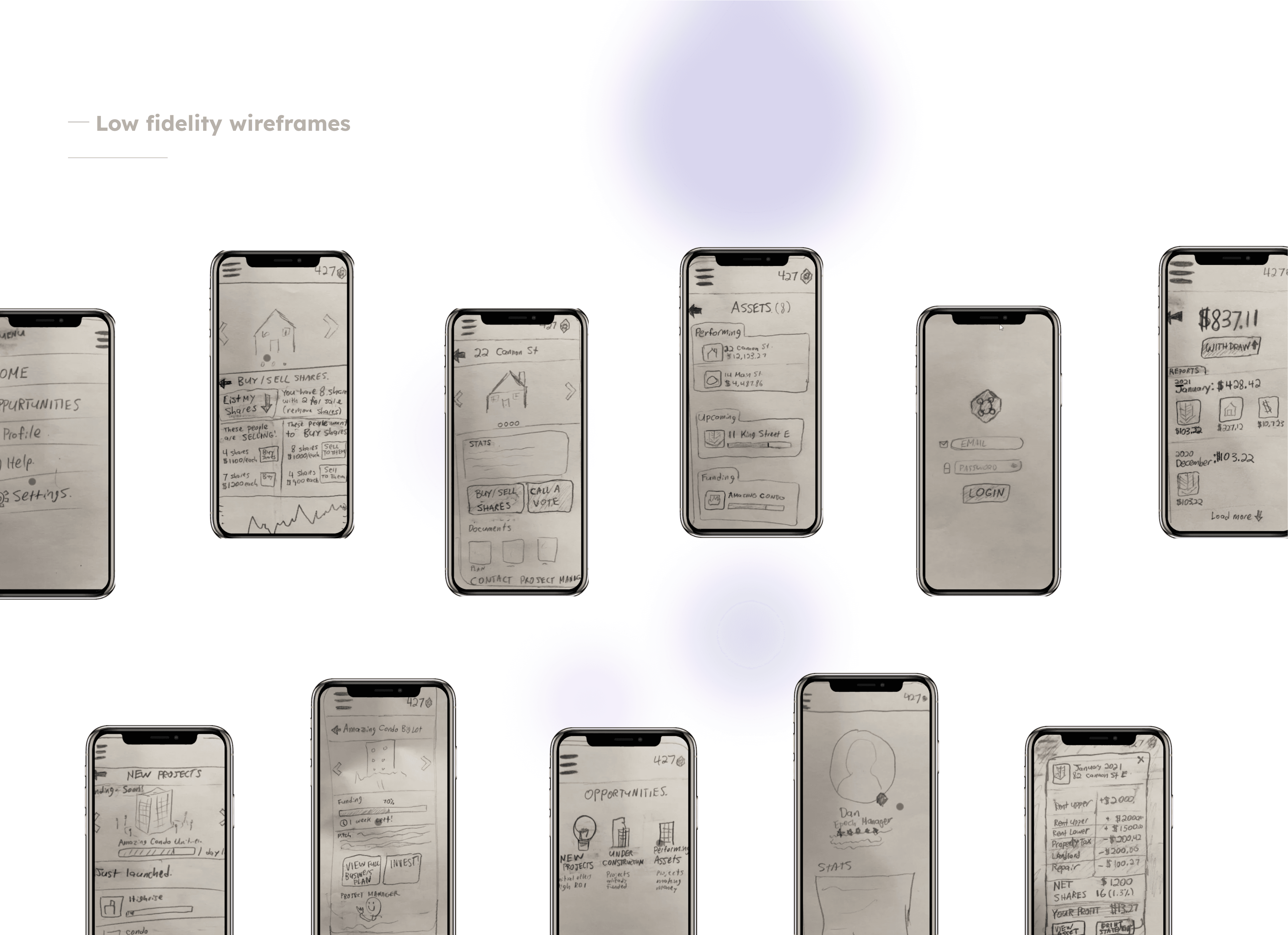
Early product sketches used as the starting point for the MVP.
Managing an investment
I connected asset performance, token ownership, trading and property decisions inside the same flow. Users could move from an individual investment into market data and the actions available to them.
From asset overview to trading, market data and property voting.
Evaluating an opportunity
New projects needed enough information for someone to evaluate the investment before committing. I structured the project details, business plan, project manager information and token purchase around that decision.
Project details, business plan, manager profile and investment entry point.
Understanding the payout
The return was broken down before the user reached the withdrawal step. Income, operating costs and ownership share were shown together to explain how the final payout was calculated.
Property income, costs, ownership share and final payout before withdrawal.
03 —
TAKING EPOCH PUBLIC
One system across every touchpoint
I extended the same visual system into EPOCH's public website and marketing material. The website had to explain the platform, investment model and company while keeping the same language as the product.
The public experience
The six-page website brought the product, investment model, team and public communication into the same visual system.
The EPOCH website across its main pages and interactions.
The final MVP brought the interaction model and visual system together across the main EPOCH flows.
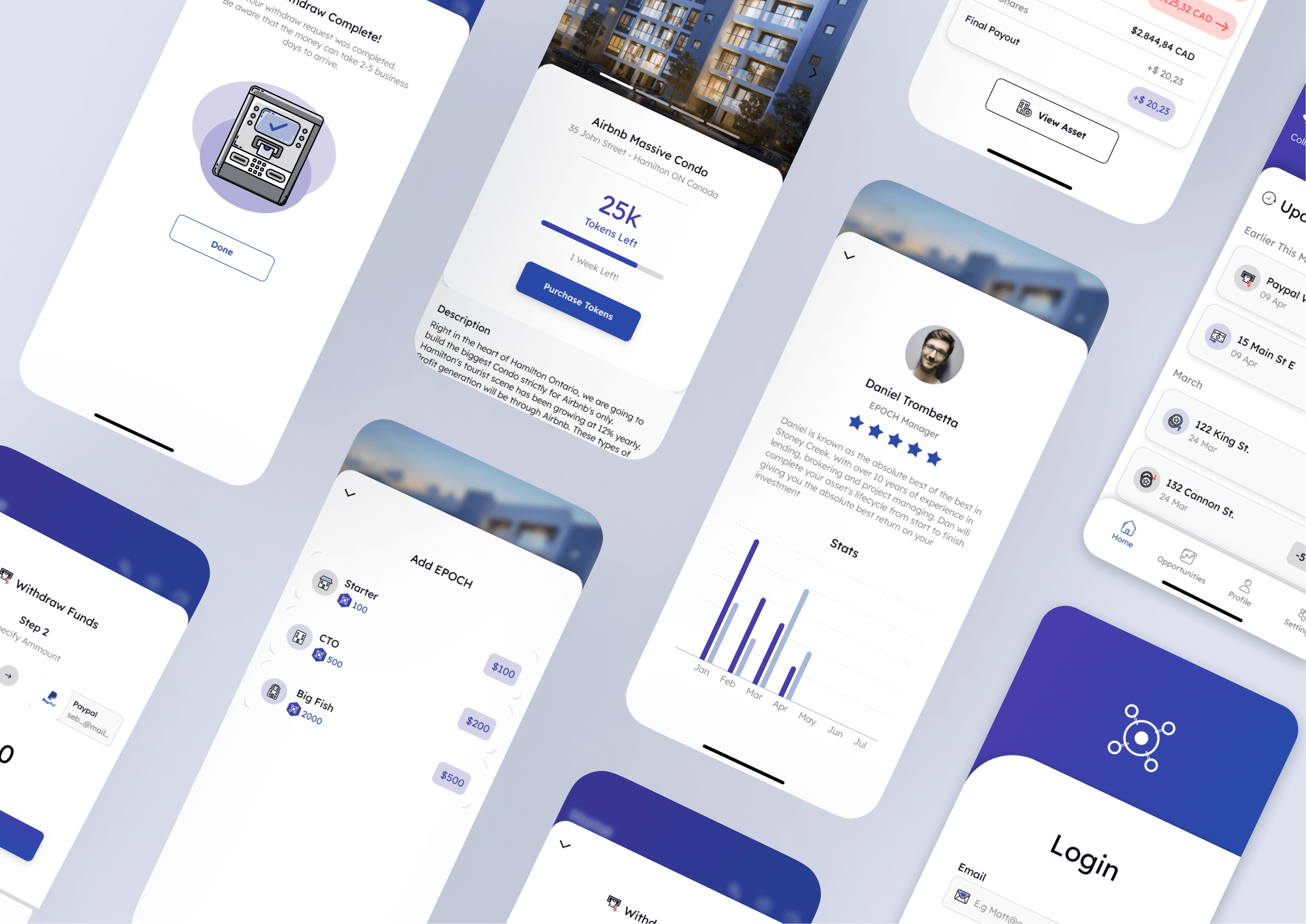
Selected screens from the EPOCH MVP.
Credits & Technical Scope
Client
EPOCH
Product Designer
Sebastián Gallego Niebles
Business Leads
Matthew Stubbs
Platform
Native iOS MVP, responsive web
Tools & Methods
Product design, financial product review, prototyping, brand exploration
Softwares
Sketch, Figma, Zeplin, Adobe suite